Unit 42: The SlideDeck Report
Learning Objectives
 After studying this unit, you will be able to
-
-
-
- understand the difference between a slide deck, presentation, and written report
- understand the importance of slide decks
- know the steps in the slide deck design process
-
-
Introduction
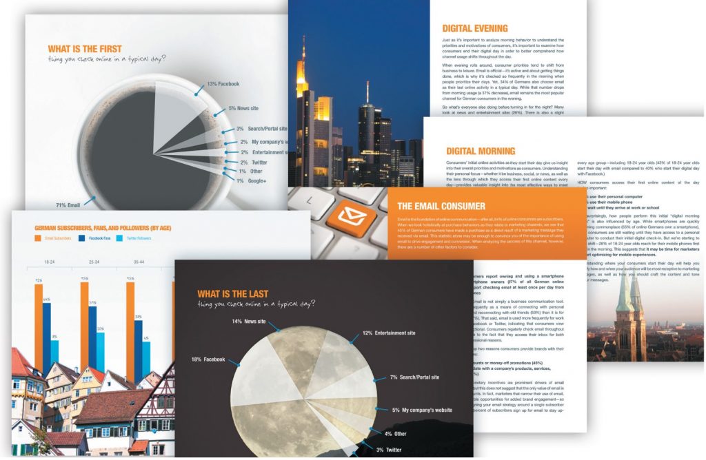
In the modern day business environment, reports are also delivered as digital documents called slide decks. Slide decks are digital reports that can be delivered via email or uploaded to an online site. Slide decks are a midway point between traditional presentations and written reports. Although a slide deck is a presentation, it is meant to be read by the receiver, not presented by the sender. A slide deck contains more text and fewer images than a typical presentation, but less text and more images than a written report. These characteristics make slide decks more inviting to read and easier to understand than written reports while providing more information than a typical presentation. For this reason, more and more professional fields are using slide decks to organize, summarize and present information on a wide range of business functions and trends.

Designing a Slide Deck
In the video below, a pioneer in the field of slide deck presentations, Nancy Duarte, provides some tips on designing slide decks.
Why Use Slide Decks
Slide decks have become popular in business for several good reasons.
Pre-meeting Document: Slide decks present information in a short, easy-to-read, accessible format. It’s normal to provide information in advance to meeting attendees. The accessible characteristic of a slide deck allows everyone time to preview the issues and come to the meeting ready to share their views and make decisions. Therefore, a slide deck serves as a pre-meeting document that informs participants of the important point
Independent Reading: A presentation requires a speaker to explain the information presented. However, a slide deck provides just enough information to clearly communicate the main ideas presented. Thus, a slide deck allows for independent reading and study at the receiver’s pace, consequently allowing a degree of convenience normal presentations do not.
Informative Handout: Providing a handout after a meeting or presentation serves to reinforce the main messages presented. A slide deck can contain the traditional main point highlights, but it can also contain interactive elements, video, and web links so the audience is able to explore all aspects of the information.
Visual Impact: Visuals help us communicate information quickly to different audiences. Visuals have the capacity to make complex information accessible. Thus, the visual aspect of a slide deck ensures that a larger segment of our audience is more likely to understand our message.
Steps in the Design Process
Choosing a Presentation Software Application
A slide deck is a presentation. Thus, different types of presentation software can be used to create your slide deck. Although the most popular presentation software maybe PowerPoint, other presentation software options such as Keynote, Google Slide, ClearSlide, and Prezi can also be used to create a slide deck presentation.
Choose a Slide Template
Your company may have preferred slide templates, but if not, choose a clean and simple slide template based on the colour palette and font of your brand. Visual consistency is the objective of the template. Each slide should feel connected by a singular feeling or theme. Keep things consistent by using a solid background colour or pattern and by using background images that have a similar colour palette. Templates can also reflect the type of organization and report. Figure 42.2 offers an example.

Minimize Content
The business writing principles of short and concise writing apply to slide decks. When developing a slide deck, aim to present information in short, individual chunks of information. Avoid redundancy by only including points and visuals that are important for your audience to “see”. Here are some other tips to ensure your content packs a punch.
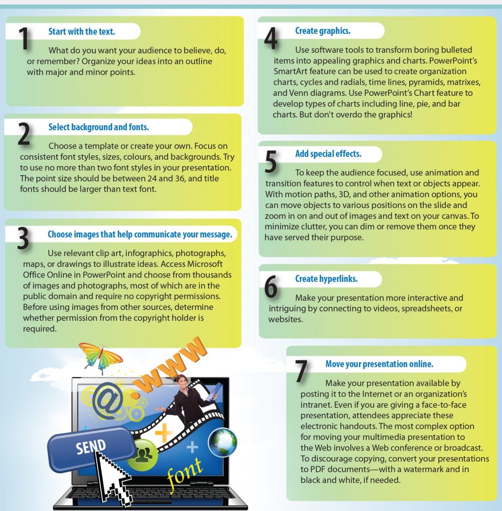
- Sketch out your ideas on paper before using your presentation software to create your slide deck. Using a slide deck planning sheet can help you complete this step.
- Write the content and structure of the slide deck first then add supportive visuals
- Chunk your information by including only one main idea per slide
- Include one image per slide
- Use 18+ font size on each slide.
- Use only one-two different fonts
- For more complex information, use multiple slides
- Customize your slide deck to your specific audience
For additional information, view Cassie McDaniel’s tutorial that features 22 tips for building great decks.
Design With Intention
Colour is one of the key ways that you can communicate visually, so it’s important to be purposeful. Remember, no two people interpret the same symbols in the same way. It’s your job to ensure your audience does not make unconscious connections in a way that will interfere with clear communication. Use colour to help your audience highlight an important concept or to focus attention on important information. For example, think about how and when to use your company’s brand colours or the colours of a competitor to help communicate your message.
Use visuals that add value to the conversation. Use only one visual per slide, so choose a chart, graph, infographic, etc. that will help you communicate your main point via that illustration. Simple and easy-to-understand graphics are preferable to complex and complicated ones. Using simple illustrations will help you communicate clearly to your audience.

The Duarte Slide Deck Manual
The Duarte Slide Deck Manual is the industry standard for the development of slide decks. Review this manual for comprehensive and in-depth information on how to create well-planned and designed slide decks. The information contained in the manual serves as a guide but also as an example of what businesses today expect from employees in the 21st century. The manual can be resized for easier viewing by using the enlarge option.
Exercises 2.1

-
-
- Review a report, proposal, or even an essay that you have previously written. Using the design principles covered in this section and presented in the Duarte Manual, convert that document into a slide deck report.
-
References
Duarte. (n.d.) Slidedocs. Resources. Retrieved from https://www.duarte.com/slidedocs/
Guffey, M., Loewry, D., & Griffin, E. (2019). Business communication: Process and product (6th ed.). Toronto, ON: Nelson Education. Retrieved from http://www.cengage.com/cgi-wadsworth/course_products_wp.pl?fid=M20b&product_isbn_issn=9780176531393&template=NELSON
Mccready, R. (2019). 25+ best pitch deck examples, tips, & templates for 2019. Venngage. Retrieved from https://venngage.com/blog/best-pitch-decks/
Stanford Graduate School of Business. (2014). Nancy Duarte: How to create better visual presentations [Video file]. Retrieved from https://www.youtube.com/watch?v=so9EJoQJc-0

