
3.8 Creating Slides for Presentations
Lucinda Atwood; Christian Westin; and Linda Macdonald
Learning Objectives
By the end of this chapter, you should be able to
- Create an organized slide deck for a presentation
- Identify best practices in selecting titles and text design
- Select visual design elements
- Provide an appropriate source citation for images from the Internet
- Determine how to select an appropriate graph, chart, or visual for storytelling
When making slides, make sure you consider these five elements: organization, titles and text, visual design, content, and user experience.
Organization
Your slide deck must be organized to match the order of your presentation. Make sure that information is presented in a logical way. For example, if you are talking about something that happens in a sequence, make sure it is in the correct order in your slides. Present information based on its importance. The size of text and list format of key points and sub-points should be consistent with their importance.
Titles and text
The appearance of your titles and text can reinforce your professionalism (your ethos).
Consistency Throughout your slide deck, titles and text should be consistent in heading and text size, bullet style, hierarchy of points, and formatting. If the style does change, it should be an intentional design choice that reflects the content. Be especially careful with team projects – it’s easy to lose consistency when more than one person creates the slides.
Brevity Your slides are not a script. If you include too much information on them, your audience will be reading, not listening to you. Slides should reinforce your key points, highlighting only the most important information. Share anecdotes, smaller details and extra information verbally.
Pro Tip
Two great methods keep slides brief: The 1-6-6 Method recommends that each slide have a maximum of 1 idea, 6 bullet points, and 6 words per bullet. The 1-3-5 Method is similar: It suggests 1 idea, 3 bullet points and 5 words per bullet, per slide.
Font style Your audience might have less than perfect vision or a small device, so make the type easy to read. Your slide should have short blocks of text. Brief text is easier to read in a sans serif font (see Chapter 2.3 for a discussion of typefaces). Highway signs, for example, are designed for small amounts of text to be read at a distance. In general, you can use a simple sans serif font like Arial or Calibri for slides that will be viewed online or through a projector.
However, you may want to add visual interest with font pairing. Limit the number of fonts you use to no more than two, one for the headings and one for the main bodies of text. An internet search of effective font pairings for presentation slides can give you some ideas (for example, see Canva). Font pairings can be one of four types, as shown in the images below along with examples of each type of pairing. Choose the pairing and the typefaces best suited to your purpose, audience, and context.
The font size depends on the size of the screen and the distance of the audience from it. If you are using a font size smaller than 32, test your slides to make sure text is visible from the back of the room or an a small device.
Use high-contrast colours for text, such as black on white, or white on navy blue. If you’re placing text on an image, use a solid background colour in the text box.
You can further differentiate text with bold or italics. Remember, though, that too much emphasis is no emphasis at all.
Spelling and grammar Checking your spelling and grammar. (Most presentation apps include spell-check tools.) Typos and grammar errors make you look sloppy and unprofessional (diminishing your ethos).
Animations You can use the app’s animation tools to move objects and text on, off, or around a slide. You’ve probably seen slides with bullet points that appear one at a time. Animations are useful when you want to gradually reveal information, for example if you want the audience to focus on one point at a time or when you want to ask a question before showing the answer.
Limit the number of animations you use, and avoid whimsical or unnecessary ones – they can make your slides annoying and unprofessional.
Transitions You can use transitions, like fade-in or fade-out, when you’re moving from one slide to the next. To avoid distracting your audience, don’t use too many different types of transitions, and avoid overly dramatic transitions. Just like animations, a little goes a long way.
Visual design
You do not have to be a designer to make professional slides; most apps include professionally-designed templates, or you can start with a blank slide. Whichever you choose, make sure the visual design supports your content and strengthens your message. Slides should relate to each other visually: Colours, layout, text and images should be consistent.
Consistency All slides should have a consistent design as though they were created by one person, not pieced together from multiple sources. If the design changes within the slide deck, the change should be an intentional design choice that reflects the purpose of the presentation. Be especially careful during team projects; it’s easy to lose consistency when more than one person creates the slides.
Alignment Keep slides looking clean and professional by aligning various text or image elements. For example, text is almost always left-aligned (except captions and titles). Space text and images so they’re balanced and visually pleasing. PowerPoint shows alignment markings to help with this.
Branding Branded elements make your slides look professional. You can use your brand’s colours and logo on the title page, and/or at the top or footer of each slide. Your branding may include fonts, text size and colour. Whatever you choose, make sure all text is easy to read and not distracting.
Images Human brains love images. Include images in your slides to add interest and explain key points. Make sure every image is high quality, high resolution, relevant and appropriate, large enough to be easily seen from afar, not stretched or distorted, and free of watermarks. (More about watermarks below).
Single images are generally better than collages because you want slides to be uncluttered. No matter how cute they are, don’t include images that are unprofessional or unrelated to your subject – such as emojis, minion pictures, and bad clip art.
Charts and graphs Well-displayed information can enhance your audience’s understanding and help to convince them that you are a professional. Charts and graphs are fantastic ways to show data, describe relationships, and help your audience understand a key point. Make sure the labels and titles are large enough to be easily read, and remove unnecessary details; you can verbally explain details and background information. If your presentation includes handouts, you can show the basic chart or graph on screen, and add a more detailed version in the handout. See “Which chart, or visual should I use? ” below for examples and additional guidelines.
Content
Complete Your presentation should include at least one slide for each key point. Make sure that only the most important information of your presentation is on your slides.
Makes sense Information presented is well researched.
Fits audience Assume that your audience is smart like you, but doesn’t have specialist knowledge. Take the time to explain anything that the majority of people might not know.
Citations and references For facts, quotes, or other statistics, you may want to include your source on the slide, especially if it adds credibility. Otherwise, sources (including for images) are listed in both the notes section and in a list of sources at the end of your presentation.
Authorship Include your full name at the start of your slides. You may want to include your name and contact information on your last slide.
Engages the left and right brain Audience members engage and remember better when you engage the “left brain” – logic, facts, science, numbers, and hard data – as well as the “right brain” – emotion, colour, artistic and sensory information like music, videos, and other media.
Audience experience
This element is a bit different from the ones above because it focuses on the live integration of your slides and your presentation.
Slides enhance the presentation Remember that you are the star of the show, and your slides are there to support your live delivery. For this reason it is important to ensure that you don’t use the slides as a teleprompter – always practice and know your entire presentation and slideshow thoroughly. Avoid turning your back to the audience to look at the slide while speaking.
Number of slides is reasonable Practice delivering your presentation to ensure you’re not rushing through too many slides or forcing the audience to stare a the same slide for too long.
Agenda / overview Longer or more complex presentations (for example, case study presentations) often include an agenda or overview slide. Shorter presentations typically don’t use them.
Animations and transitions executed When practicing your presentation, remember which slides have animations or transitions, and practice advancing your slides at the right time. Sometimes presenters get caught up in their content and forget to move the slides ahead.
Using other people’s images
You can use your own images in your presentations. You can also use downloaded images, but be careful to use copyright-free images, and credit them properly, even if no attribution is required for use.
Many images that you see online are copyrighted, meaning you can’t use them without the creator’s permission. A lot of those images have watermarks to make sure people don’t use them, or pay to use them. Don’t use watermarked images—it’s illegal and unethical. A watermark looks like this:

Where to find images
Many high-quality images are freely available online. Sources include
- Creative Commons
- Pexels
- Unsplash
- Pixabay
- Flicker – Creative Commons license
- Google: Enter your search words and click Search. Then click Images, and then Tools (underneath the search bar). Then click Usage Rights and select Creative Commons Licenses.
How to give credit
Always give credit to the creators of anything you didn’t create – including images, charts, graphs, video, audio and gifs. You don’t need to credit anything you made yourself. Your authorship is implied as no source is provided.
Put image credits in the Notes section of the slide. Also list the credits on one slide at the end of the presentation.
Citations have three parts. Use the following citation form:
[Title of the Creative-Commons-licensed image] by [Creator] licensed under [license type]
Link to each of the three elements– title, creator, and license. For example, the following image should be cited as

Some sites, like Unsplash, provide the appropriate source attribution for you when you download the image.
Which graph, chart, or visual should I use?
You can easily make charts and graphs for your presentation, using Excel or Google Spreadsheets. Add the data to the spreadsheet, then decide which type of chart or graph to use.
No matter what type you use, always include a title, clear labels, and high-contrast colours that are visible to all users. For example, many people can’t see the difference between red and green, so avoid using them together.
The most common types are presented here:
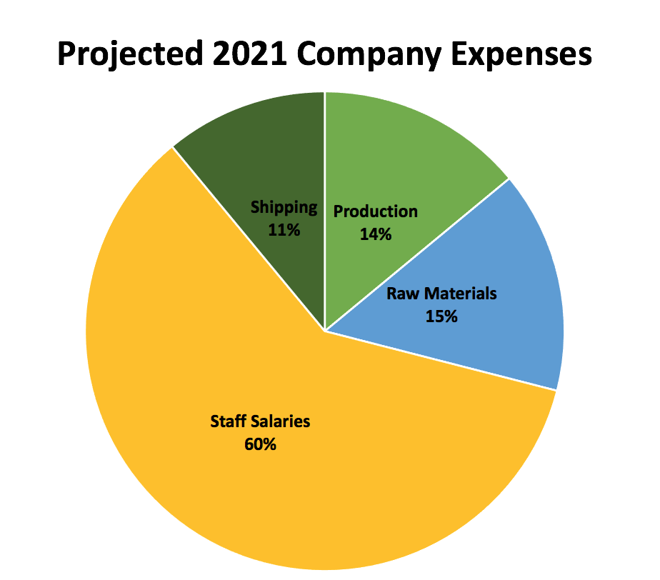
Pie charts show percentages – portions of a whole. The total segments should add up to 100% or a complete whole. Pie charts are excellent for showing relationships. In the example below we quickly see that Staff Salaries are a huge portion of the company expenses.
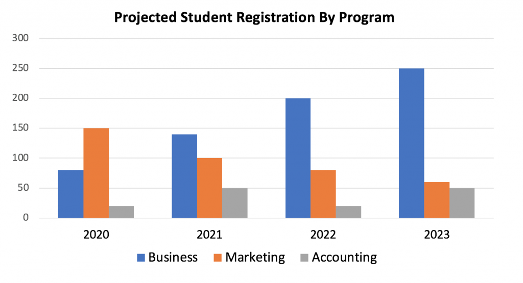
Bar graphs allow comparison between different values, and can show changes over time (if the difference in values are large). The horizontal and vertical axis must always be labelled. This graph shows that the number of Business students is expected to rise, while the number of Marketing students will decrease.
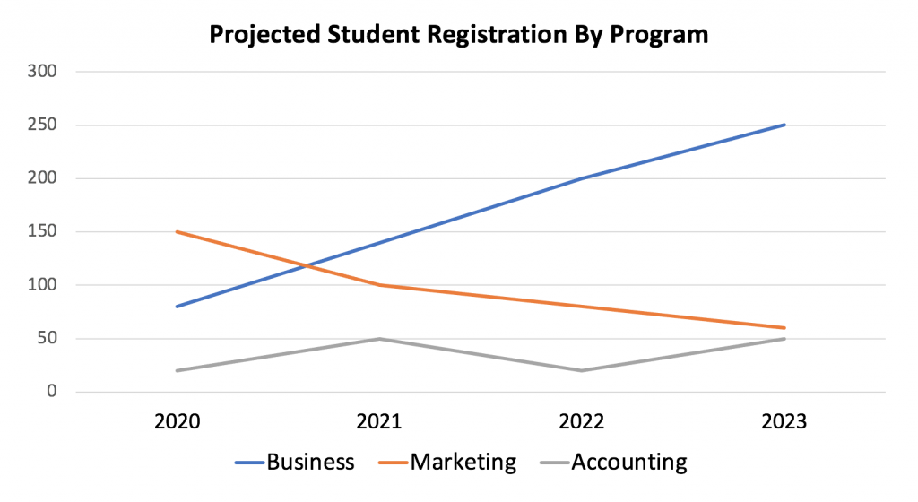
Line graphs show a trend or progress over time. They can show small changes over time better than a bar graph. Note that the example below shows the same data used in the chart above, but the line graph emphasizes the trend of business registrations growing, marketing registrations declining, and accounting registrations remaining low with a bit of fluctuation. This graph would be better if you wanted to focus on changes over time.
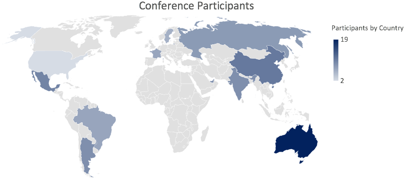
Heatmap charts use colour to convey the magnitude of certain values. Examples include a risk management heatmap showing low, medium, and high risk based on the likelihood and impact of various outcomes, or an atlas heatmap as displayed below. Because heatmaps depend only on colour – not shape or size – be very careful to use colours that all users can see.
Which chart? An example
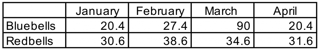
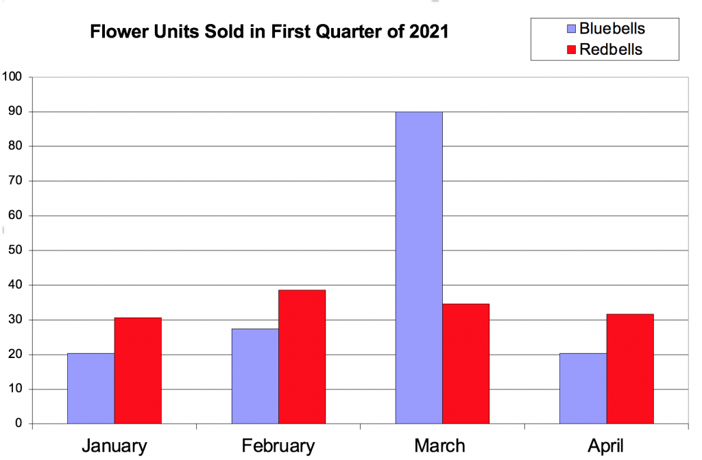
Imagine that our team is excited to share the success of our recent marketing campaign to promote bluebell flower sales during the month of March. Here are two ways we might display the data. Look at both and note your response: Which one is easier to understand? Which do you prefer to look at?
Example 1
Example 2
Example 1 is harder to read because it’s not visual. There are many numbers, no hierarchy or colour, and the heavy lines compete with the content. It’s not easy for the viewer to quickly understand the information. This example also lacks a title or legend (a description of what the data is conveying).
Example 2 shows the same information, but in a way that’s easy to quickly understand. This version emphasizes the dramatic success of our marketing campaign, which boosted sales of bluebells during March. Also notice the inclusion of a title, legend, clear axis labels, and colour coding – all of which help the audience’s understanding.
Check Your Knowledge
