7 Conversion Optimization
Learning Objectives
In this chapter, you will learn:
- Which digital marketing tactics you can test and improve
- How to pick the right test for your goals and purpose
- How to perform conversion optimisation step-by-step to improve the effectiveness of your online marketing efforts
Introduction to Optimize
Planning, research and strategy are important for executing digital marketing campaigns that resonate with users. As part of executing these strategies, you need to create digital assets, and then use various channels to drive traffic to those assets, and build relationships with your users.
As you are doing all of this, it’s important to know, “Is it actually working? And how might it all work better?”
This is where Optimise comes in. To ensure you earn the best return on your advertising investment, you need to track, analyse and optimise your digital assets and campaigns to achieve the best results. (Yes, that’s track, analyse and optimise, or TAO, so you’ll never forget it.)
As Eric Schmidt, executive chairman of Google, said, “The Internet will transform advertising because of its trackability, not its beauty.” Since most actions online are recorded, we can build a rich, data-driven picture of how our digital assets and online campaigns are performing. Digital allows us to use this data to test and improve our marketing efforts and then release new, better versions of campaigns rapidly.
With user-friendly reporting interfaces and free, powerful web analytics tools such as Google Analytics, there is no excuse for not knowing what’s happening in your campaigns. The chapter on Data analytics will help you with the concepts and definitions you need, and show you how to set objectives and key performance indicators (KPIs) so that you know what you need to measure.
It’s easy to rely on web analytics tools to report the ‘what’ without applying your brain to understand the ‘why’ and the ‘what next’.
The chapter on Conversion optimization takes you through the steps of turning data into something useful: insights that let you transform website visitors into active customers.
Getting into the routine of using data to understand how your visitors are behaving and how you might influence that behaviour is what conversion optimisation is about. You need to use the web analytics data not just to report on how campaigns and digital assets are performing, but also to understand how to make these perform better.
Introduction
Let’s look at a real-world example to help explain what conversion optimization is. Think of a shoe store. When laying out the store, a lot of care has been taken in determining where to place displays, mirrors, chairs and the till. However, there is no way of easily determining if the current layout is the best option.
For example, the till may be at the front of the store. It may be worth testing to see if moving the till to the middle of the store affects sales. This would require tracking sales over a period of time with the till in the front of the store, shutting down for a few days while the store is reorganised and then tracking sales with the new layout, all a little impractical.
However, if we have an online store, we can just show slightly, or very, different versions of web pages to visitors and track how different versions affect sales. We don’t need to shut down our website to create new versions and we can watch the real-time results emerge as hundreds of customers pass through the store. The cycle of tweaking and testing websites in this way is called conversion optimisation. This chapter will take you through the steps in a conversion optimisation process, helping you understand how to make things work better.
Key terms and concepts
| TERM | DEFINITION |
|---|---|
| A/B test | Also known as a split test, it involves testing two versions of the same page or site to see which performs better. |
| Ad Server | The technology that places ads on websites. |
| Call to action | A phrase written to motivate the reader to take action such as sign up for our newsletter or book car hire today. |
| Click path | The journey a user takes through a website. |
| Cookie | A small text files that are used to transfer information between browsers and web servers. They help web servers to provide the right content when it is requested. |
| Conversion | Completing an action that the website wants the user to take. Usually a conversion results in revenue for the brand in some way. Conversions include signing up to a newsletter or purchasing a product. |
| Conversion rate | The number of conversions divided by the number of visitors expressed as a percentage. |
| Funnel | In web analytics or conversion optimisation, an established set of steps a user should take in reaching a goal, such as making a purchase. |
| Heat map | A data-visualisation tool that shows levels of activity on a web page in different colours. |
| Hypothesis | A statement that is being tested. |
| Landing page | The first page a visitor sees on a site. Usually it is specific to a campaign being run. |
| Micro- conversion | A small conversion in the path to a full conversion, such as going from step one to step two in a checkout process of four steps. |
| Multivariate test | Testing combinations of versions of the website to see which combination performs better. |
| Null hypothesis | The default or general position, usually where no difference is the hypothesis. |
| Split test | Also known as an A/B test. |
What can you test?
The short answer: everything! However, there are some good tactics to start testing.
Email marketing
The most obvious place to start testing your email marketing is with subject lines. A simple split test will help you to determine which version of a subject line improves open rate. Within an email, you can test your call to action copy to see how you can improve clickthrough rates. Email is also a good medium to test different kinds of offers to see how they influence sales. These can be combined with testing different types of content: long copy versus short copy, or images versus video.
You can also test delivery days and times for your email, either with a split test or by testing with your whole group at different times of the year.
Display and search advertising
There are many different conversion points you may want to test with advertising. You can test to see how different adverts may improve clickthrough rate, or you can test to see how different adverts affect the conversion rate of the traffic coming to your website.
Different calls to action in the adverts can be tested, as well as different headlines. When it comes to display advertising, completely different versions of banner adverts can be tested.
Most Ad Servers, including Sizmek and Google’s AdWords, have built-in testing. This means that no additional code is required in order to run tests. In most cases, the Ad Server will also serve adverts based on the results of the test, so that the better-performing advert is given preference over time.

Social media
If you are broadcasting or distributing messages via social media, you should test your messages to see which perform better. Usually, you will be testing to see how you can increase engagement, whether that’s replying to messages, liking Facebook posts, retweeting posts shared on Twitter, or clicking through on links shared.
Types of messages can be tested to see which increase interactions. Some options to try are direct questions, shared links, overt requests to take an action, or other messages to generate engagement. Types of media can be tested, such as images versus video. Time of day or day of the week can also be tested, to see how these affect interactions.
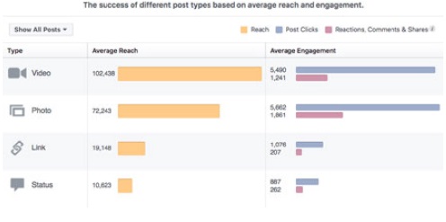
It can be trickier to test social media messages scientifically, as the environment is difficult to impossible to control.
Landing Pages
A landing page is the first page a visitor sees on a website. In some web analytics packages, it is referred to as an entrance page. Any page of your website could be a landing page, especially if users are coming to your website via search engines.
However, when you are running online campaigns that utilise tactics such as email marketing or online advertising, you often send visitors to a specific landing page. Because you choose the page that visitors see first, you have an opportunity to craft a page that converts. There are many things you can test on landing pages:
- Heading: Different headings can make your visitors behave differently.
- Copy: Style, tone, layout and length of copy can all be tested, as well as things like the font size.
- Call to action: Different calls to action could increase actions.
- Colour: Test the colours of buttons, green and red are two common choices to try.
- Images: Ddifferent images can have an impact on conversions.
- Offer: Don’t forget, you can also test different types of offers on a landing page or word the same offer differently.
eCommerce
There are many things you can test on eCommerce websites, but the most obvious are to test your product pages and your checkout process. With eCommerce, you are usually testing to increase your conversion rate ( when more consumers buy from you), or to increase your basket size (when consumers buy more from you). As your testing becomes more sophisticated, you will hopefully be achieving both.
On product pages, you should be testing to see how you might encourage users to start the purchasing process. Some things to test include:
- Images: Images of different sizes, or entirely different image content, could make a big difference.
- Call to action: Seeing the words ’Add to cart’ or ‘Buy now’ may affect shopper behaviour.
- Shipping information: Test to see whether displaying shipping costs before actual checkout affects the volume of customers starting the checkout process, as well as its effect on completing the purchase.
- Credibility information: Do ‘secure shopping’ badges affect conversion rate?
Product pages are also a good place to test how you might increase basket size. You can test displaying complementary or similar products. If you spend time on Amazon, you’ll see that they display items that customers bought together, suggesting you should do the same.
The checkout process is incredibly important to test. Often, an online purchase takes place over several screens, or steps. Instead of looking at the overall conversion rate, you should be looking at the conversion rate between steps. This is referred to as funnel analysis.
If possible, you should test a single-page checkout versus the multi-page approach. Test credibility and reassurance statements in the checkout process. Font size can also have an effect on conversions.
The above should give you an idea of where you can start with your conversion optimisation, but it is by no means an exhaustive list.
Designing Tests
To design tests successfully, you need to know what you can test, how you can test and what sort of time periods you are looking at for testing. If it’s your first time doing conversion optimisation, you should start with simple and quick tests, to get a feel for the process before embarking on more complicated tests.
Types of Tests
When we talk about conversion rate optimisation, we are usually referring to running split tests. A split test is one where we show different versions of a web page to groups of users and determine which one has performed better.
We can run A/B tests. Here each version being tested is different from all the others. A/B tests always involve just two versions of what is being tested: the original and an alternative.
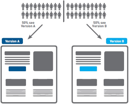
A/B tests are ideal for an initial foray into conversion optimisation, as they can be easy to set up. If you are running just one alternate and the original, it can also mean that you get a quicker result. When conducting A/B testing, you should only change one element at a time so that you can easily isolate what impact each factor has on your conversion rate.
We can also run multivariate tests, sometimes referred to as MVTs. Here, a number of elements on a page are tested to determine which combination gives the best results. For example, we may test alternative headlines, alternative copy and alternative call to action buttons. Two versions of three elements mean that we are testing eight combinations!
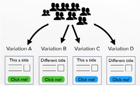
Multivariate tests can be more complicated to set up, but allow you to test more elements at once. Multivariate tests are ideal when you have large traffic volumes. If traffic volumes are not very high, it can take a very long time to reach a statistically significant result, especially if there are many combinations being tested.
Length of tests and sample size
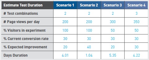
Several factors determine which tests you can run. Relatively simple calculations help you to determine how long a test is likely to take, which is based on the number of participants as well as the improvement in conversion rate. We’ve included some sample size calculators in Tools of the trade, in section 20.6 of this chapter.
Number of Participants
The number of participants in the test is determined by how many users actually see the page being tested, as well as what percentage of your potential customers you want to include in your test.
The number of users who see the page being tested may not be the same as the number of visitors to your website. You’ll need to use your data analytics to determine the number of users viewing that specific page. Of course, if you are running advertising campaigns to direct traffic to the page being tested, you can always spend a bit more money to increase the number of users coming to that page.
You also want to determine what percentage of users will be involved in the test. In a simple A/B test, if you include 100% of your visitors in the test, 50% will see version A and 50% will see version B. If you include only 50% of your visitors in the test, this means that 25% of your overall visitors will see version A and 25% will see version
B. Including 100% of your visitors will give you results more quickly. However, you may be concerned that your alternative version could perform worse and you don’t want to compromise your performance too much.
Change in conversion rate
While this is not something you will know upfront, the percentage change in conversion rate also affects the length of a test. The greater the change, the more quickly a statistically significant decision can be made.
Number of variations
The more variations you have, the longer it will take to determine which combination performs the best.
These factors can then be used to calculate the suggested length of time for a test to run. There are several online calculators that do this for you. A good one to try is this one, offered by Visual Website Optimizer
Designing for analysis
The purpose of running tests is to improve performance. To do this, you analyse your results against what you expected to find and then choose the option that performed better. This sounds simple, but how do you know what counts as better enough to warrant a change? Is it one more click than the other option, three more clicks, or should one perform 25% better than the other? You also need to think about chance: how certain are you that the differences in your results were not just coincidental? These can be tricky questions.
To determine which option in your split test did better, set parameters and assess the statistical significance of your results. In statistics, we create a null hypothesis. For split tests, the null hypothesis is that there is no difference between the performance of the two options and any difference recorded is due to chance. You then use statistics to calculate the p value, which shows whether the difference was likely due to chance (or not). If the difference is significant, it is probably not due to chance. Generally, to be significant, the p value should be less than or equal to 0,05, indicating a less than 5% probability that the difference in performance between the two options was due to chance.
You do not have to be able to perform the complex statistical calculations. Handy tools like VWO’s split test significance calculator will do this for you. All you have to do is enter the number of users that visited your control version and the number of conversions, as well as the number of users that visited the variation and the number that converted. The calculator then provides your p value and states whether your test is significant enough to change to the variation. You can find the calculator on the VWO website
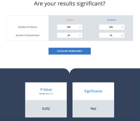
When designing your tests, it is important to consider the null hypothesis and set the parameters for significance. By keeping these aspects in mind, you will develop tests that allow for clearer and easier analysis, which will make the whole testing process that much more effective.
Step-by-step guide to conversion optimisation
The basic approach to conversion optimisation is:
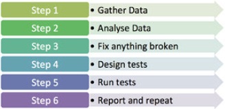
Step 1. Gather data
The very first step is to gather data about the site you are testing so that you can make smart decisions about what to test and how. There are many sources that can be used, depending on the nature of the site that you are testing. Of course, you also need to know the business for which you are testing, what do you want website visitors to do?
- Analytics data: Existing web analytics data can be used to determine which pages in your site should be tested. You can also gather data about particular pages on your site using tools such as Crazy Egg or ClickTale.
- User data: User labs or simple site surveys (Kissmetrics is a useful tool for these) can also be used to add qualitative data to the quantitative data gathered using web analytics tools.
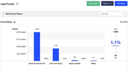
- Customer service data: If you are running tests for a site where users also speak to customer service, you can gather data about the site from customer service representatives. They should have information on common reasons why visitors make a phone call. Your CRM system may also hold some valuable data.
Step 2. Analyse
Having gathered data, you need to analyse it intelligently so that you can start designing tests. There are some key questions that you need to answer at this stage.
What should users be doing on the site?
This is where you look at the actual conversion. Usually, this is an action taken by a user that increases revenue for a business. There are obvious conversions to look at, such as placing an order or completing a lead generation form. However, it can also be useful to understand less obvious conversions, or micro-conversions.
You could run a test to see what would reduce the bounce rate of a page. The aim of an online bookstore is to sell books, but they could also test to increase newsletter signups and focus on selling books later. Micro-conversions can also refer to the path to conversion. Often, there are established steps a visitor should take in the conversion process. Conversion optimisation can look at each step. The Visitor Flow report in Google Analytics can be a great help in providing this insight. Knowing what actions or conversions you are testing is about knowing the business and its website well.
Who is coming to the site and why?
To understand who is coming to the website and why, you need to look at data that tells you about your visitors and about how they got to your website. Visitor information includes their location and richer demographic information, such as age and income, if available. Another key point to look at is the type of device they use, desktop, tablet, or mobile phone, for example.
To understand why these visitors come to your website, you need to be able to analyse your sources of traffic. The search keywords sending you traffic should tell you something about the intent of your visitors, for example.
What are they doing on your site?
Of course, now you need to understand what your visitors are doing and why they’re not doing what you want them to do. Here you need to look at metrics such as bounce rate and exit rate for important pages. As well as examining your overall conversion rate, look at the steps in the process and see where those drop offs occur.
Look at which page is the most visited landing page, especially as this may not be the home page. Look to see which pages are exit pages and determine if those should be the last pages a user sees on your site. You can use internal site search information to see if visitors are looking for particular information on your website.
Step 3. Fix anything that’s broken
As part of your analysis, you may have identified problems that can be fixed without testing. Before you continue, fix these! You should also try to understand if there is traffic coming to your site that is not relevant and try to segment that traffic from your calculations.
For example, if you have a beautifully designed website that sells custom couches, but is featured in a website design gallery, you may get a lot of traffic that is coming only to look at your site and not to buy couches.
Step 4. Design Tests
By now you should know what areas of your site need testing, so it’s time to design tests.
Wishpond (2016)[1], provides The 3 Step formula for creating an A/B Testing Hypothesis. These are:
- Step 1: Conversion problem
Why aren’t people converting? - Step 2: Proposed solution
What tests can be run to fix the conversion problem? - Step 3: Impact statement
How do you anticipate your proposed solution will affect the conversion problem. You now have a sound A/B testing hypothesis.
Step 5. Run Tests
Implement the tracking code needed to run your tests. Most testing software uses cookies to ensure that return visitors see the same version of the test they saw initially. You will also need to put tracking code on your conversion page. Before taking your test live, test to make sure that the tracking code does not conflict with any other code on your website.
If everything checks out, take your test live and wait for the data to be collected. Check in regularly to see how the test is proceeding and wait for a statistically significant outcome.
Step 6. Report and Repeat
When you have a result, it’s time to report on it. Refer back to your null hypothesis to determine if the outcome was as expected and if it was statistically significant. In your report, you should include why things went as expected, or why not.
Implement the better-performing solution and plan your next test. There is always something you can improve.
Tools of the Trade
Online, conversion optimisation relies on being able to record which version of a test a web visitor sees and whether or not that visitor converted. A returning visitor should also see the same version they saw the first time to avoid confusion. There are many software solutions that help you to do this.
Google now provides a dedicated tool called Google Optimize for website and AB testing, as well as personalisation solutions. It integrates seamlessly with Google analytics, provides for split testing, multivariate testing and redirect testing. A built- in visual editor helps you to create variations to test, without needing to recode each page. Optimize makes managing your experiments much simpler with an activity log, experiment previews and by keeping track of user permissions. By facilitating testing, Optimise enables you to create pleasant and engaging user experiences for your customers when they visit your website.
There are many split test calculators online that help you to determine the significance of split tests if you are running them yourself.
Kissmetrics is a popular analytics package that also includes testing and optimisation features. It refers to itself and a customer engagement automation system. I is a system designed for deep data tracking and provides real insights into performance and user experience. Its ability to store information from every customer who ever interacts with your brand, not only assists with CRM, but sales leads as well.
ClickTale is a web analytics tool that helps you to visualise how particular pages are performing by showing heat maps of mouse movements and clicks on a page. It also offers form analysis, showing how particular form fields may be affecting completion rate.
HubSpot offers a free tool, HubSpot Marketing Free, which helps you improve your conversion optimisation. You can add a popup CTA to your site and HubSpot will give you in-depth insights on prospects and current contacts.
Case Study: Tinkoff Bank
One-line summary
Tinkoff Bank, one of Russia’s top four credit card issuers, improved its website conversion rate using split testing.
The challenge
Tinkoff Bank relies on its website for finding new customers, as it operates on a digital platform rather than using physical branches. Users fill in an application form on the website and submit it for approval, then receive their credit card at their homes.

The application page involves a multi-step form and details about the application process and credit card plan. The form submission counts as a conversion. Tinkoff is always looking for ways to increase these conversions.
The solution
Tinkoff identified key pages on the site that could be optimised. It used web analytics data to discover that the credit card application page had a high bounce rate, so it focused on helping the user stay on the application page to complete the conversion. They introduced new features in three areas:
- An additional information box
- Gamifying the form with a progress bar
- Allowing users to fill in their details later on.
Additional information box
Tinkoff worked off the assumption that offering additional details about the credit card would increase signups. They created two variations of the original page. The first had a hyperlink to ’more details’ under the CTA, which led to a new page with additional information

The second variation opened a box right below the link instead of leading to another page.

Progress Bar
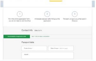
Here, the bank used the hypothesis that a progress bar on top of the four-step application form would encourage users to fill in the form completely.
They used two variations. The first had a yellow banner-like progress bar above the form that highlighted the step the user was currently on and used a black line to show the user’s progression.
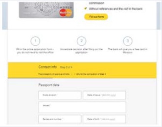
The second variation had a green progress bar without an extra line to show the user’s progress. Instead, the green portion of the bar grew as users moved through the form.
Filling in details later
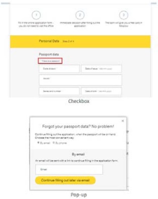
Tinkoff Bank thought that allowing users to fill in passport details later on would increase the number of submissions. This time, they only created one variation to compare to the original.
When users reached the section for passport information, they could click a box saying, “Don’t remember passport details” and a window would appear asking them to choose phone or email to provide their details later on.
The Results
Additional information box
The first variation, with a link to another page with extra information, did worse than the original page. However, the second variation:
- Improved conversion rates by 15.5%
- Had a 100% chance of beating the control.
Why these results? Key differentiators on a web page can improve conversions and emphasising free shipping and the bank’s credibility both made users feel happier about their choice. However, the first variation led users away from the signup form, adding additional effort to return to the form.
Progress bar
Both progress bars outperformed the control. The first variation had a 6.9% higher conversion rate than the control and the second variation improved the conversion rate of the original by 12.8%. Both had a 100% chance to beat the original page.
Why? Users don’t like lengthy forms but a progress bar can be reassuring.
Filling in details later
The variation was a resounding success:
- The conversion rate of the form improved by 35.8%
- The after-filling conversion rate improved by 10%.
Remember, users are less likely to complete a form if they are led away from it and fetching a passport would mean leaving the form.([2]
The Bigger Picture
As you’ve seen at the start of this chapter, conversion optimisation applies to just about every part of your digital marketing strategy. Almost any tactic can be tweaked, tested and improved. In fact, this is best practice and highly recommended.
Conversion optimisation also speaks to a bigger consideration about keeping your channels up to date in the ever-changing online marketing space. Keeping things fresh and constantly improving is the way to go. Not only does this entice your customer, it also reflects on your bottom line, making valuable, incremental improvements increases your earnings in the short term and decreases the need for radical changes over time.
Chapter Summary
Conversion optimisation is the process of testing to increase the conversions from a website or digital campaign. A conversion can refer to any action that a web visitor takes. Tests are either A/B tests, or multivariate tests. It’s important to understand the business and customers, so you can create appropriate, useful tests.
The basic approach to conversion optimisation is:
- Gather data
- Analyse data
- Fix anything that’s broken
- Design tests
- Run tests
- Report and repeat.
Case Study Questions
- Why did Tinkoff bank try two different variations for the first two tests?
- Why was testing so important in this case?
- Discuss why the winning variation outperformed the others in each case.
Chapter Questions
- Describe a situation where an A/B test would be more suited as a data-gathering method than a multivariate test.
- What is a conversion rate and why is it so important to marketers?
- What can you test on an eCommerce product page? List three examples.
References
VWO Blog, 2015. 3 Ways Tinkoff Bank Optimized Credit Card Conversions – Case Study. [Online] Available at: vwo.com/blog/tinkoff-case-study[Accessed 13 November 2017]
Wishpond, 2016. The 3 step formula for creating an A/B testing hypothesis. [Online] Available at: blog.wishpond.com/post/115675436717/ab-testing-hypothesis[Accessed 20 October 2017]
Figure Acknowledgments
Figure 1. Screenshot, Google, 2017.
Figure 2. Buffer, 2017. blog.bufferapp.com/what-to-post-on-each-social-media-platform
Figure 3. Explore Web Solutions, 2013. explwebsolns.blogspot.co.za/search/label/google%20adword
Figure 4. Working Homeguide, 2014. www.workinghomeguide.com/21458/ab-testing-vs-multivariate-testing
Figure 5. Stokes, 2013.
Figure 6. VWO, 2017. vwo.com/ab-split-test-significance-calculator
Figure 7. Own image.
Figure 8. G2Crowd, 2017. www.g2crowd.com/compare/google-analytics-vs-kissmetrics
Figure 9. VWO, 2015. vwo.com/blog/tinkoff-case-study
Figure 10. VWO, 2015. vwo.com/blog/tinkoff-case-study
Figure 11. VWO, 2015. vwo.com/blog/tinkoff-case-study
Figure 12. VWO, 2015. vwo.com/blog/tinkoff-case-study
Figure 13. VWO, 2015. vwo.com/blog/tinkoff-case-study
Figure 14. VWO, 2015. vwo.com/blog/tinkoff-case-study

