Reading: Packaging
Creating the Perfect Package
Product packaging is an underappreciated hero in the marketing world. Packaging is supremely functional: it protects the product. It contains the product. It displays the product. It promotes the product. It’s design and labeling communicate about the product. And the package itself can even increase the product’s utility, making it better suited to however the customer wants to use it.
If packaging does all these things, why is it undervalued? As a marketing tool, packaging often feels low-tech and old-school in the information age. It’s just not as sexy as Web sites, events, or social media—and yet, it remains a staple of the purchasing environment.
With the increased emphasis on self-service marketing at supermarkets, drugstores, and even department stores, the role of packaging is significant. For example, in a typical supermarket a shopper passes about six hundred items per minute—or one item every tenth of a second. Thus, the only way to get some consumers to notice a product is by in-store displays, shelf hangers, tear-off coupon blocks, other point-of-purchase devices, or, last but not least, effective packages.[1]
Packaging provides an opportunity for a product to jump out and differentiate itself on the crowded, viciously competitive shelves of supermarkets, drugstores, department stores, and other retailers. Every single customer who buys a product inevitably interacts with the packaging, which is what makes it such a potentially powerful touchpoint.
The Roles Packaging Can Play
Marketers invest a great deal in motivational research, color testing, psychological manipulation, and so on in order to learn how the majority of consumers will react to a new package. Based on the results of this research, past experience, and the current and anticipated decisions of competitors, marketers determine what primary role the package will play relative to the product. They determine which of the following needs to be included:
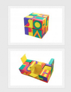
- Quality Example: Lush Handmade Cosmetics won awards for their recyclable gift box for Lush demonstrating true packaging engineering by morphing into new shapes as it’s folded and refolded to reveal a range of 8 products to the consumer. Once products are removed it becomes a unique keepsake box. Unique and innovative, it was a sell-out in many countries. Taking inspiration from a Rubik’s cube, the secret to its design lies in four pairs of interlocking compartments, each with a unique one-way locking tab. When interlocked in a specific order they create a never-ending, free-flowing design that, even when filled with products, holds its shape.

A recyclable gift box for Lush demonstrating true packaging engineering by morphing into new shapes as it’s folded and refolded to reveal a range of 8 products to the consumer. Once products are removed it becomes a unique keepsake box. - Safety
Example: Product protection and child-proofing are standard features in the packaging of Tylenol, Benadryl, Children’s Motrin, and other over-the-counter drugs. - Instruction
Example: Dosage information for drugs and “how to use this product” information for a variety of appliances, devices, and other products helps ensure that consumers use products responsibly and as intended. - Legal compliance
Example: Health Canada, Canadian Competition Bureau and the Canadian Food Inspection Agency maintains strict regulations about the types of information food companies must disclose on their product labels: ingredients, calorie counts, nutritional information, serving size and servings per container, and so forth. - Distinction
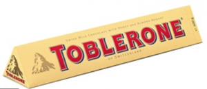
Example: Packaging can be distinctive as a familiar, favoured brand: the Coca-Cola or Heinz Ketchup bottles, the Campbell’s Soup can, the Kleenex tissue box. Alternatively, designers may use colour, shape, materials, labeling and other packaging features to convey something is new, different or improved such as Toblerone’s iconic triangle.
Toblerone Chocolate’s distinctive shape is an inherent part of its brand packaging - Affordability
Example: In packaged goods, packaging simplicity and plainness—for generic and store-brand products—often suggests greater affordability in the minds of consumers. - Convenience
Example: Resealable packages have been a welcome, convenient packaging innovation for a variety of products, from baby wipes to sliced bologna to snack foods. - Aesthetic beauty
 Example: Perfume manufacturers devote extensive time and attention to making beautiful, distinctive designs for perfume bottles and packaging. One estimate suggests that for each $100 bottle of perfume, the manufacturer’s expense for the bottle and packaging is $10. Meanwhile, their expense for the bottle’s contents is only about $2.[2]
 - Improved utility
Example: Packaging single-serving yogurt or applesauce in tubes rather than traditional packages makes them usable in more settings and circumstances because they are less messy and no longer require spoons or a table-top to be able to eat them effectively. - Sustainability
Example: Environmentally-friendly packaging can create brand preference from consumers who are conscious about their carbon footprints. Using fewer chemical-based inks and dyes, less wasteful packaging design, and preference for recycled and recyclable materials all set products apart as “green” and eco-friendly.
Matching the Package to the Product . . . and the Consumer
Clearly delineating the role of the product should lead to the actual design of the package: its colour, size, texture, location of trademark, name, product information, and promotional materials. Market leaders in the dry food area, such as cake mixes, have established a tradition of recipes on the package. However, there are many package-related questions. Do the colours complement one another? Are you taking advantage of consumer confusion by using a package design similar to that of the market leader? Can the product be made for an acceptable cost? Can it be transported, stored, and shelved properly? Is there space for special promotional deals? Finally, various versions of the product will be tested in the market. How recognizable is the package? Is it distinctive? Aesthetically pleasing? Acceptable by dealers?
Packaging designers can be extremely creative when it comes to incorporating multiple requirements into the container design. The key is to understand what factors most influence customer decisions about what to buy. For a given purchase situation, any of the factors above–or a combination of them–might help a consumer settle on which product to buy.
In some product categories, promoting the package has become almost as important—if not more important—than promoting product performance. This is true for products as diverse as powdered and soft drinks, margarine, perfumes, and pet foods. In the case of Pringles, the stacked potato chip made by Procter & Gamble, a package had to be designed that would protect a very delicate product. Hence the Pringles can. When it introduced Pringles to the market, Procter & Gamble took a risk that retailers and consumers would be open to something new.

Packaging and Brand Loyalty
Packaging is one dimension of a brand that can contribute to customer loyalty. Familiar or aesthetically pleasing packaging can simplify the buying process in customers’ minds. The package is a clear extension of the brand, and brands with strongly loyal fans (or “tribes,” as they are sometimes called) may create significant brand equity associated with the package.
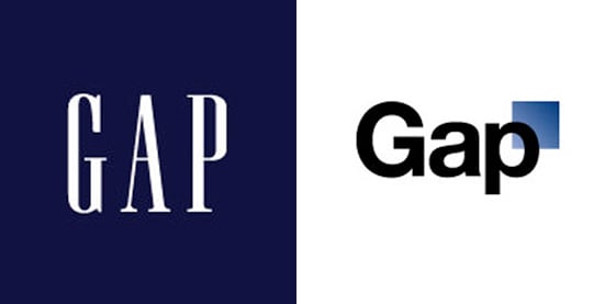
GAp’s 2010 Logo
An interesting example of this phenomenon is actually a brand misstep on the part of clothing manufacturer Gap. In “Amanda Sibley describes what happened when Gap introduced a new logo in October 2010. The company was trying to make its image more contemporary and hip. How long did the logo last?

A whopping two days.
Gap quickly put the old logo back into place after unbelievable backlash from the public. Gap, known for everyday basics, tried to redo their image to appeal to a more hip crowd. Unfortunately, they didn’t understand who their target market is—people who want the basics and aren’t interested in trendy styles. Their loyal customers felt that Gap was changing their image for the worse and lost a connection with the brand. Gap was also unsuccessful at attracting the younger, trendy generation with the redesign (albeit only a two-day redesign), resulting in a failure on two fronts with this new logo.
It wasn’t so awful for Gap to pursue a logo redesign, the lesson is simply to stay in touch with your buyer personas so you can ensure your new design reflects them. Marketers focus a lot on metrics—for good reasons—but never underestimate your audience’s feelings toward your brand. They’re harder to quantify, sure, but boy will people speak out when their sensibilities are offended.[3]
- William O. Bearden and Michael G. Etzel (1982, September) Reference Group Influence on Product and Brand Choice, Journal of Consumer Research. 183–194 ↵
- Thau, B. (2012, March 22). Behind the Spritz: What Really Goes Into a Bottle of $100 Perfume. AOL.com. AOL. https://www.aol.com/2012/05/22/celebrity-perfume-cost-breakdown/. ↵
- Sibely, A. (2017, November 28). ↵

