
Images, Accessibility & Alt Text
Creating Accessible Images[1]
Images are non-text elements that include photographs, illustrations, diagrams, pictures, charts, graphs, and maps.
What do you need to do?
Identify the purpose or value of the image to your textbook. Consider the following questions:
- Does your image serve a functional purpose? In other words, is it conveying non-text content to students?
- Or does your image serve more of a decorative purpose? In other words, is it primarily a design element that does not convey content? If yes, you should avoid unnecessary text descriptions.
Functional images
Consider what your content page would look like if the images didn’t load. Now try writing alternative text for each image that would work as a replacement and provide the same information as the image.
There are three ways to provide alternative text descriptions for images:
- Describe the image in the surrounding text.
- Describe the image in the alt tag.
- Create and link to a long description of the image. See section on Long Descriptions.
Descriptions in surrounding text
You can use the surrounding text to provide the same information as conveyed by the image. This is often the best option for complex or technical images because it makes the information available for everyone, not just those using the alt tags.
Alt Tags and Image Descriptions[2]
Alt tags are used in two cases:
- When an image doesn’t download due slow Internet, the alt tag content will display instead of the image.
- For people who are visually impaired and use screen readers, when a screen reader finds an image, it will read out the content of the alt tag.
An alt tag refers to the alt attribute (alt is short for alternative) within an image tag. All images uploaded into Pressbooks have an alt tag, but for them to be useful, you need to insert an image description.
Creation Tips
- Keep it short, usually 1-2 sentences. Don’t overthink it.
- Consider key elements of why you chose this image, instead of describing every little detail.
- No need to say “image of” or “picture of.”
- But, do say if it’s a logo, illustration, painting, or cartoon.
- Don’t duplicate text that’s adjacent in the document or website.
- End the alt text sentence with a period.
- If the image is purely decorative leave the alt text blank.
Length
- Alt tags should be no longer than 125 characters, including spaces and punctuation.
- This is because when a screen reader finds an image, it will say “Graphic” before reading out the alt tag.
- If the alt tag is longer than 125 characters, the screen reader will interrupt the flow of text and say “Graphic” again, before continuing to read out the alt tag. This can be confusing.
- For images that require descriptions longer than 125 characters, see the section on long descriptions.
Resources
An alt Decision Tree by W3Schools in Image Tutorial
Decorative Images
If an image does not add meaning it doesn’t need an alt tag. Do not add alt text if the image:
- is included for decorative or design purposes only, or
- is adequately described in the caption and/or surrounding text.
If an image is only used for visual decoration, leave the alt text field blank. Pressbooks will mark it as decorative by adding double quotation marks to this field (“”). This instruction tells screen readers to ignore and move to the text piece of text.
Including alternative text descriptions for decorative images “simply slows the process down with no benefit because the screen-reading software vocalizes the content of the [alternative text description], whether that alternative text adds value or not.”[3]
When the alt tag is left blank, the screen reader will not announce the presence of the image and will skip to the next content.
Complex Image Descriptions
If the image cannot be described in one (1) to two (2) sentences, include a longer description. Alternative text descriptions for these images should have:
- A concise description of the image, pointing users toward a longer description that is created and available below the image or linked to an Image Description section at the end of the chapter or a Long Description section.
Long Descriptions
- Longer descriptions can take the form of figure descriptions or be links to external webpages that describe the image in full.
- If an image contains a large amount of text, this text should be duplicated in the longer description.
- Proper alternative text is critical for ensuring the information provided in an image is not lost in a digital environment (for example, the image upload link breaks or is no longer available).
- If images or icons are used to link to another page, they should describe the purpose of the link, not the visual appearance of the image or icon (unless this is meaningful).
- If a logo has been included on the page and is related to the content (for example, author attributions), include the logo’s name in the alternative text.
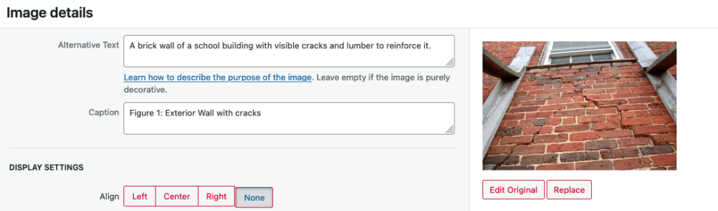
How to Add Alt text in Pressbooks
- To edit an image’s alt tag in Pressbooks, click on the image and select the PENCIL icon (edit).
- Under image details, there will be two textboxes: one titled “Caption” and one titled “Alternative Text.”
- The “Caption” box contains the image’s caption, which appears under the image in the visual editor.
- The “Alternative Text” box is where you describe the image.
Using colour
Consider what your images would look like if they only displayed in black and white. Would any necessary context or content be lost if the colour was “turned off?” Images should not rely on colour to convey information; if your point requires colour, you may need to edit or format the image so the concepts presented are not lost to those who are colour blind or require high contrast between colours.
Example 1: Inaccessible Bar Chart
In Chart 1, colour is the only means by which information is conveyed. For students who are colour blind, have poor contrast vision, or are using a black-and-white print copy (see Chart 2), relevant information is lost.
 |
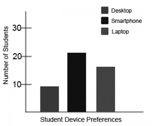 |
Example 2: Accessible Bar Chart
Students who are colour blind can distinguish between high-contrast shades. In Chart 3, contextual labels have been added to each bar at the bottom of the chart. Note that the chart will still require an alt tag.

- Adapted from BC Open Textbook Accessibility Toolkit. Authored by Amanda Coolidge, Sue Doner, and Tara Robertson. Provided by BCCampus. Located at https://opentextbc.ca/accessibilitytoolkit/. Licensed under CC BY Attribution ↵
- Alt text section adapted from: Harvard University. (n.d.). Write helpful Alt Text to describe images. Digital Accessibility. https://accessibility.huit.harvard.edu/describe-content-images ↵
- "Top 10 Tips for Making Your Website Accessible," UC Berkeley: Web Access, accessed March 27, 2018, https://webaccess.berkeley.edu/resources/tips/web-accessibility#accessible-alt. ↵
